Marketing fashion: Clothing posters
Clothing posters
Analysing clothing adverts:
H&M
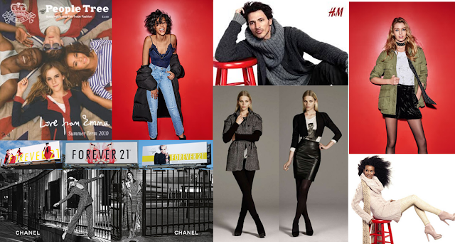
The backgrounds in this advert are the same. They are both a plain white background. There is a red stool in both of the images. The red stool and the h&m logo are the same colour so you can easily identify the brand. In the top image the man is resting on the red stool, whereas in the bottom image the woman is sitting on the stool instead. Both of the adverts have the models wearing wool jumpers/tops/dresses. They are looking to the left away from the camera with their hair blowing to the right. They are aiming these products at younger people 20-30. They have shown this through the models being a younger generation. The products are affordable therefore are not aimed at people that have a higher income.
H&M
.
TOPSHOP
The backgrounds in the adverts are both the same. They are both a bright red, this is to draw the attention of the reader to the advert. Both of the models are facing the same way in a similar stance. There is a white shadow behind each of the models. This is done to make the models stand out form the red background. This advert is aimed at a younger generation. However the clothes are slightly more expensive due to certain brands.
ZARA
The backgrounds of the images are both grey. The models are wearing similar colours (black,grey and white) this is because this range of clothing is aimed at more work wear/ smart wear. The models both have neutral make-up on and their hair behind their ears. In both images their legs are crossed over the same way. The model is the same person in each of the images. Zara is a designer brand that is affordable. Their clothes mimic other designer brands however they create their own versions that are more affordable. The brand is aimed at younger people (20-30).
CHANEL
The image in these adverts are both in black and white. This may be to get the audience to focus on the product itself instead of drawing attention onto other aspects of the advert. The main focus is on the clothes, therefore the models are not wearing any shoes or jewelry. The logo is is on the image to show what brand it is. Both of the images look as it they wear taken in Paris. The models are next to a black gate which look as if the pictures were taken in similar places.
FOREVER 21
These adverts are on a billboard.They all have a colour theme. In the first image the advert has the same model wearing the same clothes, however she is in different poses. This has been done to show the product in different ways. The logo is in big yellow font that is set forward so that the model is behind the text. The colour theme is yellow and red in this particular advert. In the middle advert the main colour is red. The model is wearing red sunglasses, a red jacket and had red/pink hair. They have used the bright colour to get the interest of people. The logo is in big black font so that it is easier to read. The logo again is set in front of the image to draw attention to what the advert is for. The model is on a white background, so they are clearer and more visible without distractions from other things. In the advert on the right it is again set on a blank (white) background with one yellow strip across the middle of the image. The logo is in white font and has a yellow box around it so that it again draws attention to the brand. The model is in front of the yellow strip. The price is on this image, which shows that the products are affordable.
In all of the adverts you can see only the top of the product. This may be because they want you to look at their website to access the full outfit.
The target market for this brand is mainly young girls/ young adults as they have lots of different ranges of clothes.
THE PEOPLE TREE
People Tree is a fair trade brand that only uses fair trade products (e.g. cotton). The image consists of three main colours (red, white and blue). This is may be because the model is British. Emma Watson features in this particular fashion line. The image shows four friends (two girls and two boys) who are lying on the floor staring straight up at the camera. They are lying on a Union Jack flag. Their logo is on the top right of the image. The logo is put there so that the readers will be able to see what brand is being advertised. The phrase 'love from Emma' suggests that Emma had personally written it. They have used a celebrity to show that wealthy, and successful people have purchased items from this particular fair trade brand. People will want to buy items that celebrity's have bought so that they can keep up with the fashion trends. This brand is aimed at different ages.However with a younger adult as a model/ representatives the majority of buyers will be the younger generation 20-30.


Comments
Post a Comment