Posts

Showing posts from January, 2018

Statement of intent (Poster Advert)

Image
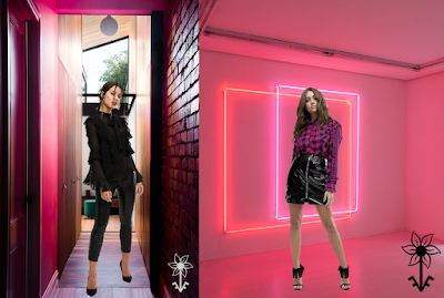
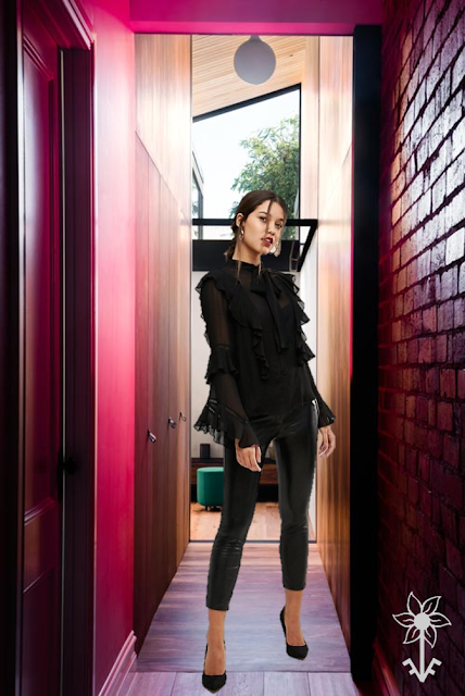
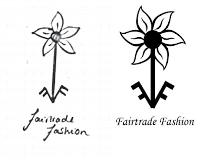
 Statement of intent 1) How do you intend to use the four areas of the media theoretical framework to communicate meaning and meet the requirements of your chosen brief? (Fair trade fashion) 2) How do you intend to link your media products to demonstrate your knowledge and understanding of the digitally convergent nature of your media production?  Media Language (conventions of the products) Media Audience (Target Audience) Media Representation (How the message is constructed about groups of people and how the audience relate to these constructions) Media Industries (The companies behind the products, the legal considerations and how profit is generated by the products. Considerations relating to cross-media platforms and where products will appear as part of the campaign.). I am going to use medium distances for camera angles, as I believe that by doing this the images will link both of the images together and make them somewhat similar. For one of my images I

Poster ideas for 'Billboard Posters'

Image
Poster ideas: Pitch: I am going to get my model to stand in the center of a corridor with pink lighting. She will be wearing a black outfit to contrast with the pink lighting. In my second photo I will also have my model surrounded by pink decor and lighting. 

Media poster logo

Image
Media poster logo

Marketing fashion: Clothing posters

Image
Clothing posters Analysing clothing adverts: H&M The backgrounds in this advert are the same. They are both a plain white background. There is a red stool in both of the images. The red stool and the h&m logo are the same colour so you can easily identify the brand. In the top image the man is resting on the red stool, whereas in the bottom image the woman is sitting on the stool instead. Both of the adverts have the models wearing wool jumpers/tops/dresses. They are looking to the left away from the camera with their hair blowing to the right. They are aiming these products at younger people 20-30. They have shown this through the models being a younger generation. The products are affordable therefore are not aimed at people that have a higher income. H&M . TOPSHOP The backgrounds in the adverts are both the same. They are both a bright red, this is to draw the attention of the reader to the advert. Both of the models are facing the

Ok Go: Representation in Music Video

Image
               OK Go: Representation in Music Video 1. How are OK Go representing themselves? OK Go have represented themselves as different and standing out from the crowd. In all three of these music videos   they have used unusual dances and settings in their music videos. For example in the 'Here it goes again' they have used treadmills to show their 'tricks'. This distinctly makes them unique as no one has created a music video like this before. This music video makes it look like there has been little money used on it. Due to the fact that the setting is very basic. Whereas in the music video obsession they have used a lot of printers and paper to create a background, as well as using wires so they can do tricks ion the air. Non-continuity editing and fast paced editing were used in these music videos to make their movements seem unnatural. The use of this again indicates that they are different and this style of music video hasn't been c

Analysing Lucozade's Advertisement

Image
Analysing Lucozade's Advertisement How have they used font and layout to engage an audience? They have used layout of the text of the left and the image on the right so that you can clearly see who is advertising the product and what the catchphrase of the product is. The font they have used is in a large text, this has been used to shift your focus so that you can see the catchphrase and then look at the image, as the colour of the text is bright and stands out more, where as the image of Gareth Bale is dull, and doesn't stand out as well.  How does the angle of the camera shot engage an audience. The camera shot engages the audience, as the model is staring straight at the camera, which may suggest that he is looking at the potential buyer/audience. This may have the affect of making the audience want to buy the product. The male model may have been used to show that if you drink this drink, then you may be as successful as Gareth Bale who has been u

Marketing fair trade research

Image
Pre-production research- Fair Trade This Starbucks advert uses the contractions  'we've'  and 'we're' to  show the informality of their advert. This informality shows that they want to appear more informal to their customer base. They use the simple sentence 'We've always been crazy about coffee.' to get their point across about their coffee now being fair trade. The colour palette they have used shows a more earthy and nature like theme. These specific colours have been used to refer to fair trade, which help farmers get a fairer price for their products. The fair trade logo is used in the center of the page to show the importance of it. This also allows the reader to understand the advert more with the image as the reference. The asterisk is used to indicate to the reader that their is more information about what the company is now 'certified' for. Which is '100% of our espresso beans are now Fair trade certified.'